Mobile app design company for apps people understand on first use
We are a mobile app design company in India that turns an app idea or a struggling app into clear user flows, tested prototypes and polished iOS and Android screens, designed to platform conventions, checked for accessibility and specified so developers can build them without guessing.
- Free design consultation
- Custom quotation, never a fixed package

- User flows
- Prototypes
- iOS and Android
Worked with





Problems we solve
Are people downloading your app and then leaving?
Most apps don't fail because of missing features. They fail because the first few minutes are confusing.
- 01
Drop-off at sign-up
Long forms, early permission prompts and unclear value lose people before they see what the app does.
- 02
Screens designed one at a time
Each screen looks fine alone, but the journey between them has dead ends and inconsistent controls.
- 03
Developers left to fill the gaps
Loading, empty and error states were never designed, so each developer invents their own.
- 04
It feels like a website in a box
Navigation, gestures and controls ignore how iPhone and Android users expect apps to behave.
Our solution
App UI/UX design that starts with the journey, not the screens
Our app UI/UX design services map what people need to do, test it as a prototype, then design every screen and state around that.
Flows before visuals
We map the key journeys and agree them with you before drawing a single polished screen.
Tested on real phones
Clickable prototypes are tried on actual devices with people who match your users, and changed based on what we see.
Ready to build
Every state, spacing value and interaction is specified in Figma, so the build matches the design.
Mobile app design services
What our mobile app design covers
Each project is scoped to your app. These are the parts most projects include.
Not sure where to start?
We'll help you pick what to build first and phase the rest.
Research and user flows
We learn who uses the app, where and why, through conversations with your team and target users and a look at competing apps. Then we map the main journeys step by step, from first launch to the task people came to do.
- User and stakeholder interviews
- Competitor app review
- Key tasks and priorities
- Step-by-step user flows
- Onboarding and sign-up flow
- Edge cases and exceptions
Information architecture and wireframes
Low-detail wireframes settle navigation, screen hierarchy and content order before colour and type come in. Changes are quick and cheap at this stage, so this is where most of the thinking happens.
- Navigation model (tabs, stacks, drawers)
- Screen inventory
- Grey-box wireframes
- Content priority per screen
- Form and input design
- Review rounds with your team
Interactive prototypes and testing
We link wireframes or final screens into a clickable Figma prototype that runs on a phone. We test the main journeys with a small group of real users, note where they hesitate, and fix the design before development.
- Clickable Figma prototypes
- Testing on real devices
- Task-based usability sessions
- Findings and changes log
- Investor and stakeholder demos
- Re-testing after changes
UI design for iOS and Android
Polished screens that follow Apple's Human Interface Guidelines and Google's Material Design where it matters, such as navigation, system controls and gestures, while keeping your brand consistent across both platforms.
- Human Interface Guidelines
- Material Design 3
- Light and dark themes
- Loading, empty and error states
- Motion and feedback
- Icons and illustration style
Accessibility and inclusive design
Apps should work for people with low vision, larger text settings, colour blindness or limited dexterity. We design for adequate tap targets, contrast, Dynamic Type and font scaling, and screens that make sense with VoiceOver and TalkBack.
- Tap target sizes
- Contrast checks
- Dynamic Type and font scaling
- VoiceOver and TalkBack labels
- Reduced motion support
- Hindi and regional text lengths
Developer hand-off and store assets
A Figma file organised for developers, with components, tokens, annotations and every state, plus store screenshots that explain the app at a glance. Our app store optimisation team can take the listing further.
- Component-based Figma file
- Design tokens and spacing
- Annotated specs
- Asset export for both platforms
- App Store and Play Store screenshots
- Design support during the build
What you get
What good mobile app design changes
An app that is easier to learn, easier to build and easier to grow.
Clearer first minutes
Onboarding that shows value before asking for effort.
Fewer surprises in testing
Problems found in prototypes, not after launch.
Faster development
Developers build from complete, specified screens.
Consistent across platforms
One design language for iOS and Android.
Accessible by design
Usable with larger text and screen readers.
Files you own
Figma files and assets stay in your workspace.
Why us
Why teams choose Zero One Creation for app design
Designers who work beside developers
We design apps we also build, so designs respect what Flutter and native code can do.
We run our own products
Classify-X and our other products show us what real users struggle with after launch.
Accessibility from the first wireframe
Contrast, tap targets and screen reader labels are designed in, not patched later.
Clear written scope
A proposal with scope, phases and a customised quotation before work starts.
Have an app idea, or an app people aren't sticking with? Show us and we'll tell you where the design should start.
A free design consultation, then a written proposal with a customised quotation.
Our approach
How we design a mobile app
Open each step to see what it covers.
01.Discover
Goals, users, competitors and the tasks the app must make easy.
02.Map flows
Step-by-step journeys for onboarding and each main task, agreed with you.
03.Wireframe
Navigation and screen structure in low detail, quick to change.
04.Prototype and test
A clickable prototype tried on real phones with real users.
05.Design the UI
Final screens and states for iOS and Android, with accessibility checks.
06.Hand off and support
Organised Figma files, specs, store screenshots and help during the build.
Common app design problems
What we fix most often in existing apps
If your app is already live, these are the patterns we usually find in reviews, and how we address them.
Onboarding asks too much, too soon
- What you notice
- People must sign up, verify and grant permissions before they see any value.
- How we fix it
- Show value first, ask for sign-up at the moment it's needed, and request permissions in context.
Too many tabs and menus
- What you notice
- Every feature has its own tab or menu item, and users can't find the main task.
- How we fix it
- A navigation model built around the three or four tasks that matter most.
Blank screens and vague errors
- What you notice
- Empty lists, slow loads and failures show nothing useful or a technical message.
- How we fix it
- Designed loading, empty, offline and error states with a clear next step.
Small text and tiny buttons
- What you notice
- Older users and people on budget phones struggle to read and tap accurately.
- How we fix it
- Larger tap targets, readable type that scales with system settings and better contrast.
iOS and Android out of step
- What you notice
- One platform was designed first and the other copied, so it feels foreign.
- How we fix it
- A shared design language with platform-appropriate navigation and controls.
Store listing doesn't sell the app
- What you notice
- Screenshots show raw screens with no context, and visitors don't install.
- How we fix it
- Screenshots designed around benefits, with captions and a clear first frame.
Tools and standards
What we design with
Tools and platform guidelines chosen so designs carry straight into development.
- Design
- FigmaFigJamFigma prototypesVariables and tokens
- Platform guidelines
- Apple Human Interface GuidelinesMaterial Design 3Platform navigation
- Accessibility
- WCAG 2.2VoiceOverTalkBackDynamic TypeContrast checks
- Testing
- Usability sessionsPrototype testing on devicesAnalytics review
- Build hand-off
- FlutterReact NativeSwiftKotlin
- Store
- App Store screenshotsPlay Store graphicsApp icons
Options
Custom app design, a UI kit or developer-led design?
Three common ways apps get designed, and when each makes sense.
| Criteria | Custom app design | UI kit or template | Developer-led design |
|---|---|---|---|
| User research and flows | Yes, before screens | No | Rarely |
| Tested before build | Prototype tested with users | No | Tested after build |
| Brand and platform fit | Designed for both | Generic look | Depends on the developer |
| States and edge cases | All designed | Partly | Decided while coding |
| Best for | Customer-facing apps that must be easy | Internal tools on a tight timeline | Simple apps with few screens |
For a simple internal app, a well-chosen UI kit may be enough. We'll tell you if it is.
Who we design for
App design across industries
Every industry brings its own users and constraints.
Education
Student apps for classes, tests and notices.
See the workHealthcare
Booking, records and reminders patients can manage.
See the workRetail and e-commerce
Browsing, checkout and repeat orders.
See the workReal estate
Listings, site visits and buyer updates.
See the workManufacturing and field teams
Orders, stock and visits for dealers and sales staff.
See the workSaaS products
Companion apps for web platforms.
See the work
How we work together
Three ways to work with us
Every engagement starts with a written proposal and a customised quotation.
UX review
A review of your live app or prototype with prioritised fixes.
Best for: Apps with drop-off or poor reviews
Full app design
Research, flows, wireframes, prototype testing, UI and hand-off.
Best for: New apps and full redesigns
Design and build
Design followed by development by the same team.
Best for: One team from idea to launch
Our product
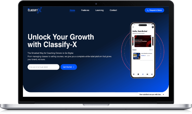
Classify-X: a mobile-first student experience for coaching institutes
- Mobile-first
- Student experience built for phones
- White-label
- Each institute under its own brand
- Live classes
- Classes, notifications and updates
- Assessments
- Randomised tests and analytics
Guide
Mobile app design: a practical guide
UX and UI: what each one covers
UX (user experience) design decides what the app does and how people move through it: the flows, navigation and order of steps. UI (user interface) design decides how each screen looks and feels: type, colour, spacing, controls and motion.
Both matter, but UX comes first. A beautiful screen in the wrong place in the journey still loses users.
Start with user flows
Before any screen is drawn, write out the main journeys step by step: how a new user signs up, how they complete the core task, how they come back. Each step should have one clear purpose.
Flows reveal missing screens, unnecessary steps and decisions the business hasn't made yet, all before design time is spent.
Why wireframes come before visual design
Wireframes are deliberately plain so that conversations stay on structure and priority rather than colour. It is far quicker to move a button in a grey box than in a finished design.
Approve wireframes for the main journeys before moving to UI. It saves rework later.
Testing a prototype with real users
A clickable prototype on a phone lets you watch people try the app before it exists. Five or six sessions with people who match your users usually reveal the biggest problems.
Give each person a task, such as booking an appointment, and watch without helping. Where they hesitate is where the design needs work.
Designing for iOS and Android
Apple's Human Interface Guidelines and Google's Material Design describe how navigation, controls, gestures and system features work on each platform. Users rely on these habits, often without noticing.
Most apps share one visual identity across both platforms but follow each platform's conventions for back navigation, tab bars, dialogs, date pickers and sharing.
Onboarding that doesn't lose people
Let people see what the app does before asking them to sign up. Ask only for the details you need now, explain why you need each permission at the moment you ask, and offer phone or Google sign-in where it suits your audience.
Every extra step at the start costs users. Treat onboarding as the most important flow in the app.
Accessibility in mobile apps
Accessible apps support larger text settings, have tap targets big enough for every finger, use colour contrast people can read outdoors, and label every control for VoiceOver and TalkBack. These choices help everyone, including older users and people on small, low-cost phones.
Our blog post on mobile app accessibility design covers the details for product owners.
Designing for Indian users
Many users in India are on mid-range Android phones, patchy networks and data plans. Design light screens, clear offline and slow-network states, and avoid relying on large images or video for key information.
If the app supports Hindi or regional languages, design with real translated text early. Labels can be much longer or shorter than English and break layouts that weren't planned for them.
Store screenshots are part of the design
The App Store and Play Store listing is often the first screen people see. Screenshots should explain the main benefit in the first frame, with short captions, rather than show raw screens in order.
Design them alongside the app so they stay accurate, and update them when the app changes.
What affects the cost of mobile app design
Cost depends on the number of flows and screens, research and testing depth, whether you need both iOS and Android variations, accessibility requirements, languages, store assets and support during development.
We don't publish fixed prices or packages. After a consultation, we send a written proposal with a customised quotation.
Before you talk to us
Frequently asked questions
What does a mobile app design company do?
Do you design for both iOS and Android?
Can you redesign our existing app?
Do you test designs with users?
Which design tools do you use?
Can you also build the app?
Do you design for accessibility?
Do you design App Store and Play Store screenshots?
Can you design an app in Hindi or regional languages?
Will developers be able to build exactly what you design?
Do you work as an app design agency for startups?
How much does mobile app design cost?
Explore related services and guides
All services- ServiceUI/UX design servicesProduct design for web and mobile.
- ServiceApp developmentWe build the apps we design.
- ServiceApp store optimisationStore listings that win installs.
- ServiceDesign systemsShared components for app and web.
- ServiceFlutter app developmentOne codebase for iOS and Android.
- GuideMobile app accessibility designGuide: designing apps for everyone.
Contact us
Tell us about your app. We'll show you where design can help.
Share your idea, prototype or live app and who it's for. Our design team reviews every enquiry and gets back to you to set up a call.
- +91 95683 56730
- Chat on WhatsApp
- contact@zeroonecreation.com
- 3rd Floor, 113 Double Phatak, Meerut Road, Roorkee, Uttarakhand 247667
- Monday – Saturday, 9 AM – 5 PM